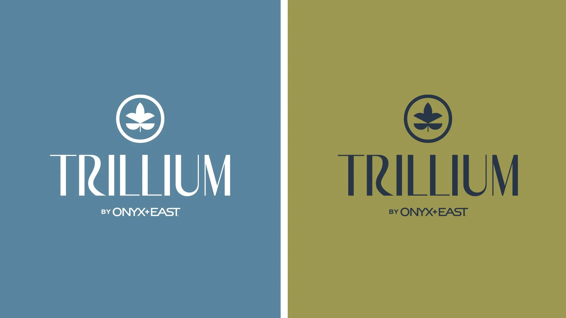
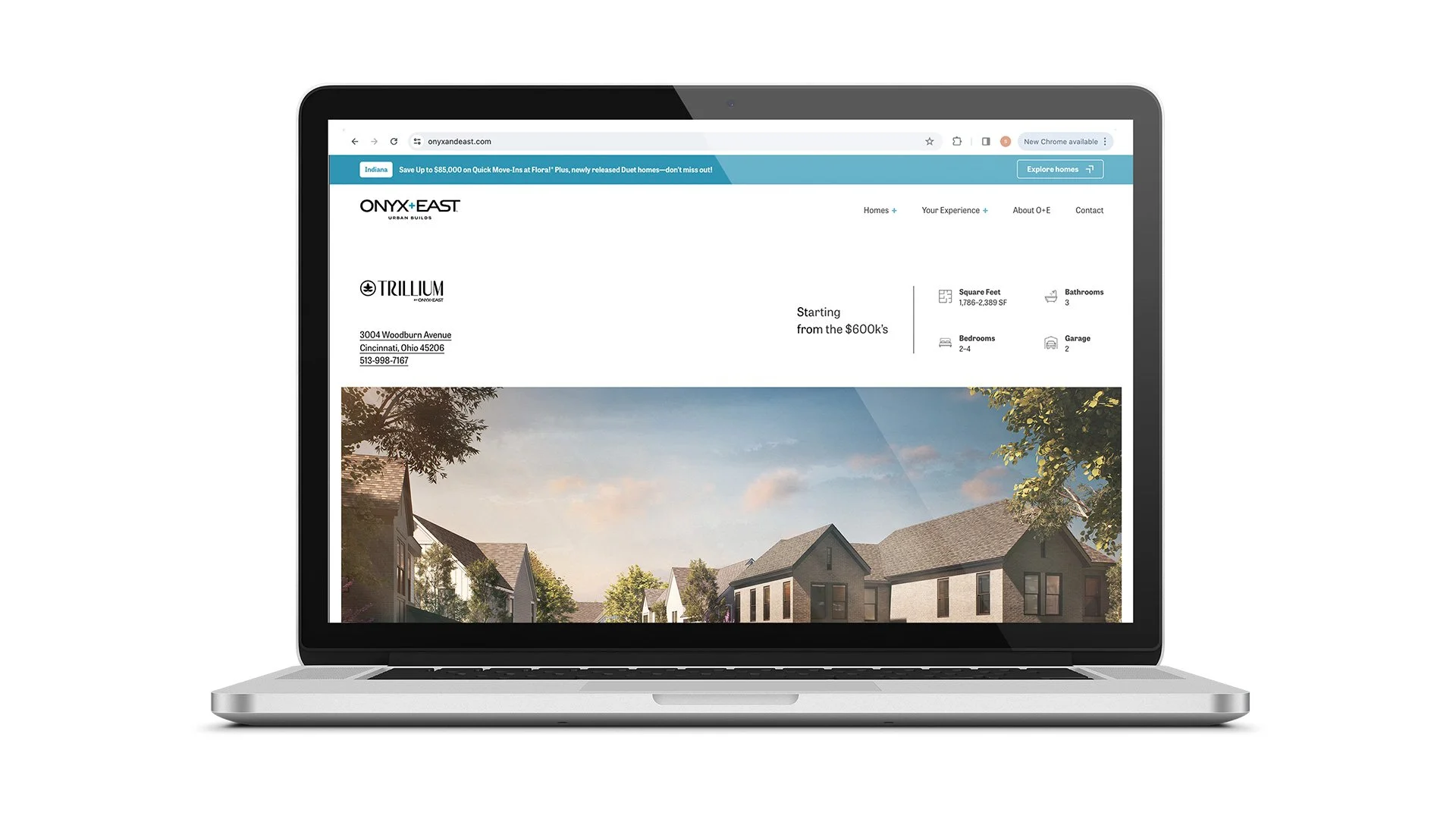
Trillium Branding
A recent logo I made for Onyx+East for their new development in Fishers. I am really happy with how this one turned out. As the property is in development, it will take some time for the brand to be expanded further in any meaningful way.
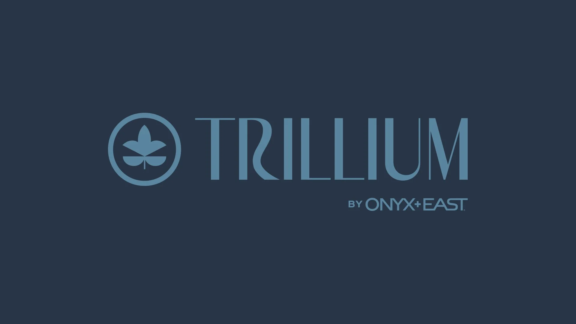
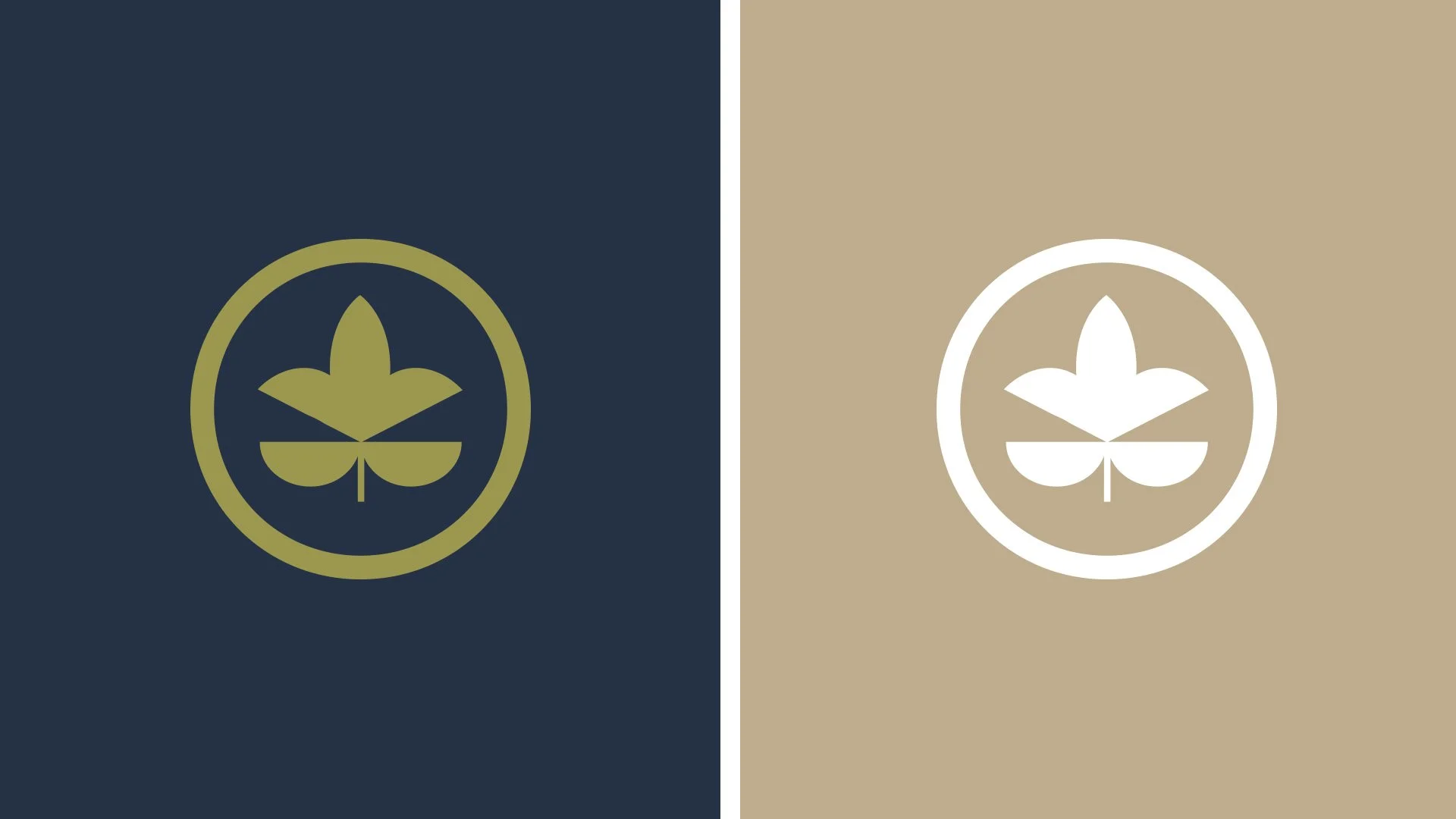
Developing a visual identity for Trillium was straightforward in one sense—the name all but required a reference to the flower itself. At the same time, that specificity created a challenge: finding a way to make the mark feel distinctive rather than expected. The final inspiration came less from the flower and more from the property’s decorative fencing, which, when paired with the floral motif, resulted in a refined, high-end identity that felt both intentional and unique.